The Smash
Full branding for a fast food
(Client)
The Smash
(Year)
2024
(Services)
Branding
About
The Smash
Flavor without rules: the Smash experience.
The Smash is a bold and energetic fast food brand with a strong passion for authentic flavors and a youthful attitude. Designed for a new generation of food lovers, The Smash combines street-style identity with high-quality ingredients to deliver an unmistakable taste experience. The brand aims to stand out with a unique visual language that reflects its rebellious and flavorful character.
the
Challenge
A new generation of fast food.
The client approached us with the need to develop a strong and original visual identity for their new fast food concept. The main goal was to create a logo that would appeal to a young, urban audience while emphasizing the brand’s commitment to taste and quality. They wanted a distinctive and memorable logo that would reflect the idea of “smashing” flavor — bold, unconventional, and full of personality. The visual style needed to convey energy, uniqueness, and a slightly raw, handmade look.
The
Results
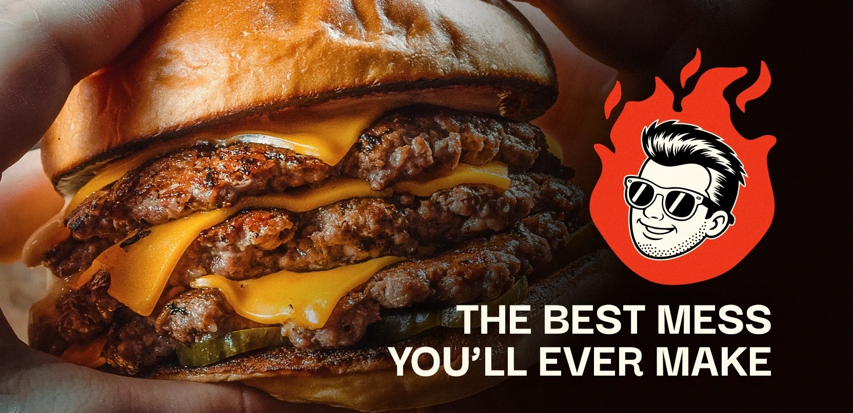
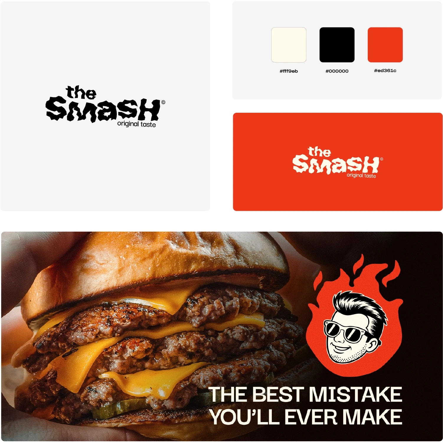
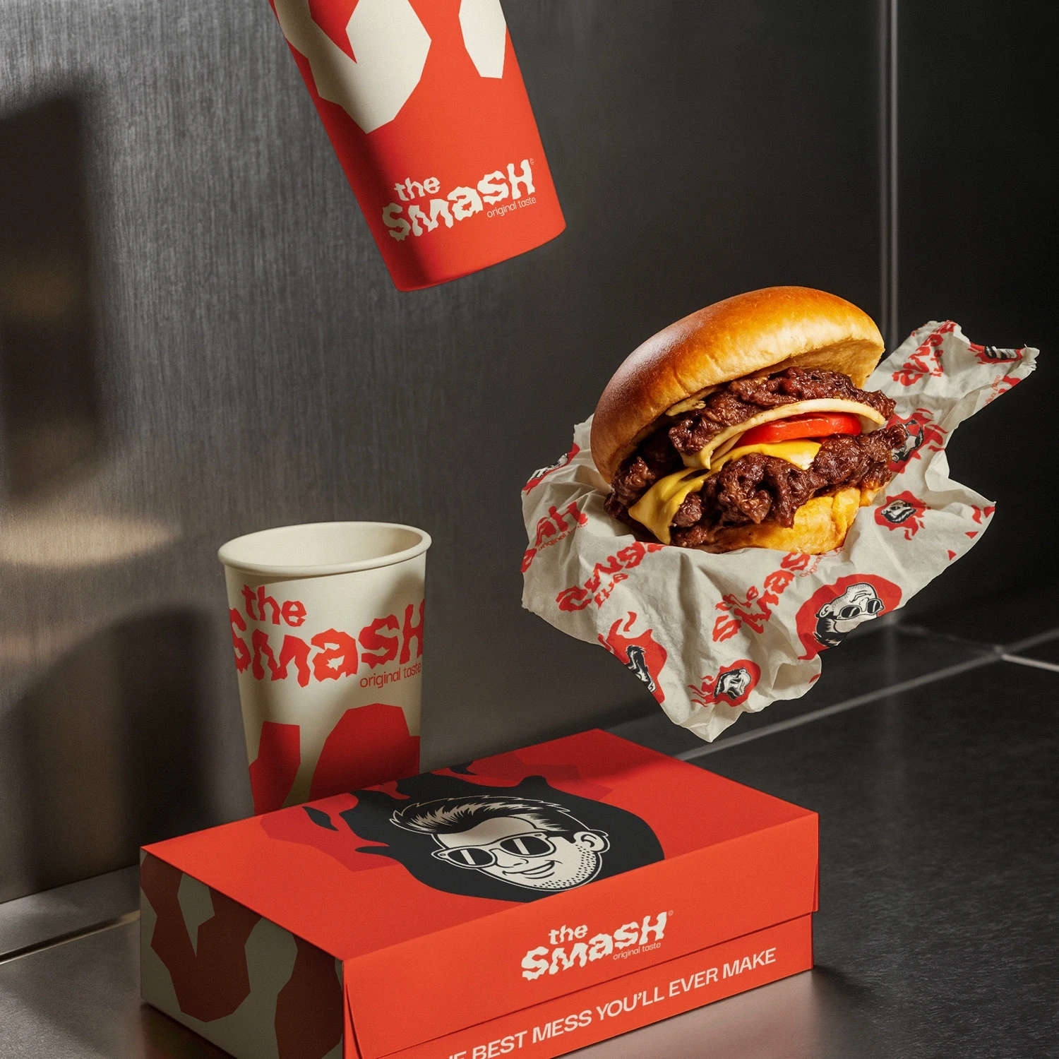
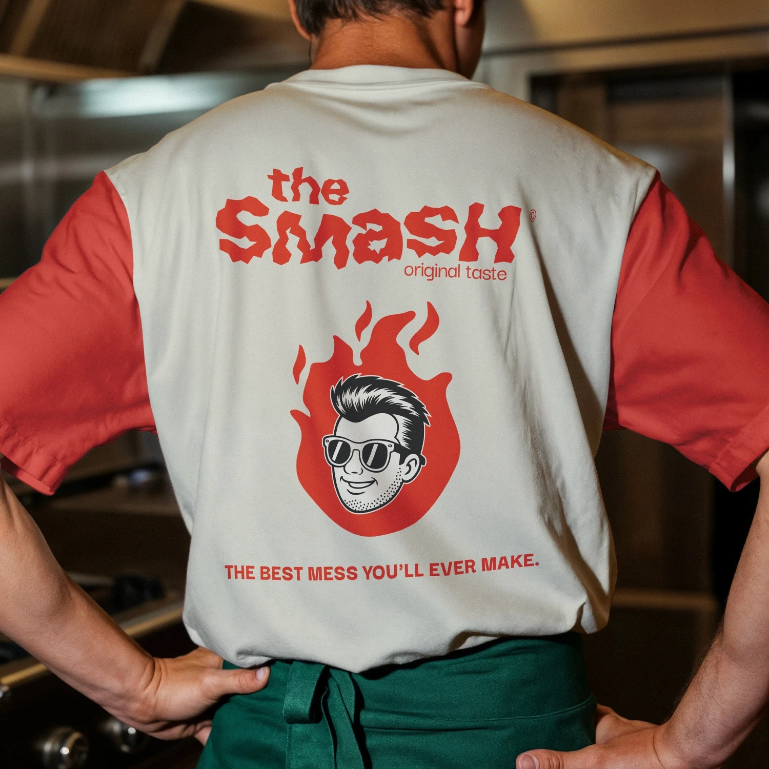
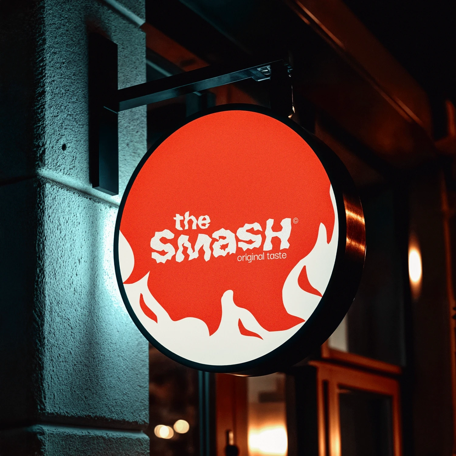
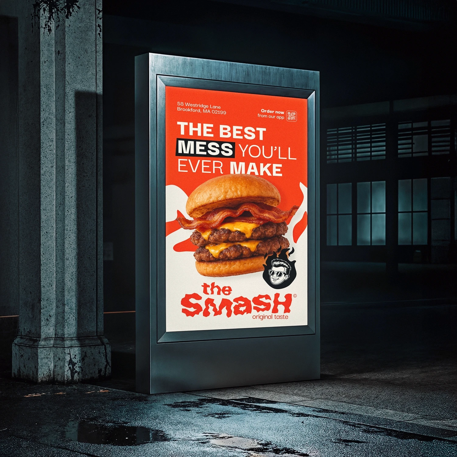
Rough, red, and real.
Starting from the brand values, we developed a custom logotype that captures the wild and tasty spirit of The Smash. The bold, jagged typography reflects the rawness and intensity of the brand, while the deep red color conveys appetite, warmth, and energy. The rough, irregular edges of the letters evoke the idea of something handmade and “smashed,” perfectly in line with the brand’s concept. The tagline “original taste” was integrated in a minimal, clean font to create a contrast that highlights the authenticity of the product. The final result is a strong, impactful logo that sets the tone for all future branding and communication efforts.
The Smash
Full branding for a fast food
(Client)
The Smash
(Year)
2024
(Services)
Branding
About
The Smash
Flavor without rules: the Smash experience.
The Smash is a bold and energetic fast food brand with a strong passion for authentic flavors and a youthful attitude. Designed for a new generation of food lovers, The Smash combines street-style identity with high-quality ingredients to deliver an unmistakable taste experience. The brand aims to stand out with a unique visual language that reflects its rebellious and flavorful character.
the
Challenge
A new generation of fast food.
The client approached us with the need to develop a strong and original visual identity for their new fast food concept. The main goal was to create a logo that would appeal to a young, urban audience while emphasizing the brand’s commitment to taste and quality. They wanted a distinctive and memorable logo that would reflect the idea of “smashing” flavor — bold, unconventional, and full of personality. The visual style needed to convey energy, uniqueness, and a slightly raw, handmade look.
The
Results
Rough, red, and real.
Starting from the brand values, we developed a custom logotype that captures the wild and tasty spirit of The Smash. The bold, jagged typography reflects the rawness and intensity of the brand, while the deep red color conveys appetite, warmth, and energy. The rough, irregular edges of the letters evoke the idea of something handmade and “smashed,” perfectly in line with the brand’s concept. The tagline “original taste” was integrated in a minimal, clean font to create a contrast that highlights the authenticity of the product. The final result is a strong, impactful logo that sets the tone for all future branding and communication efforts.